Fostering inclusivity in a parenting brand.
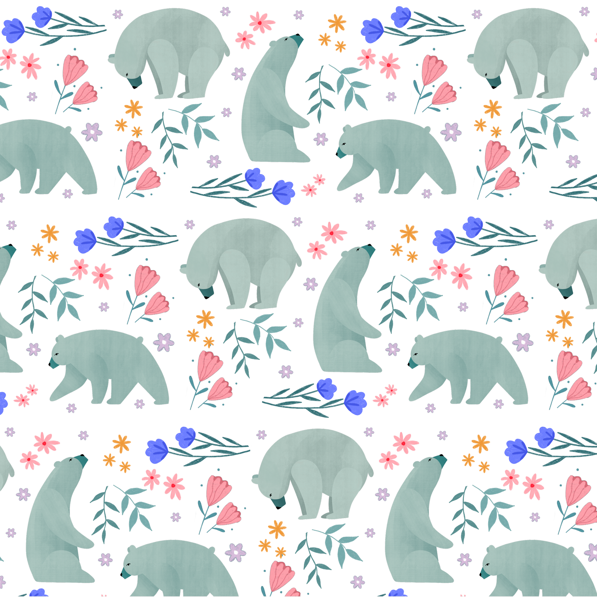
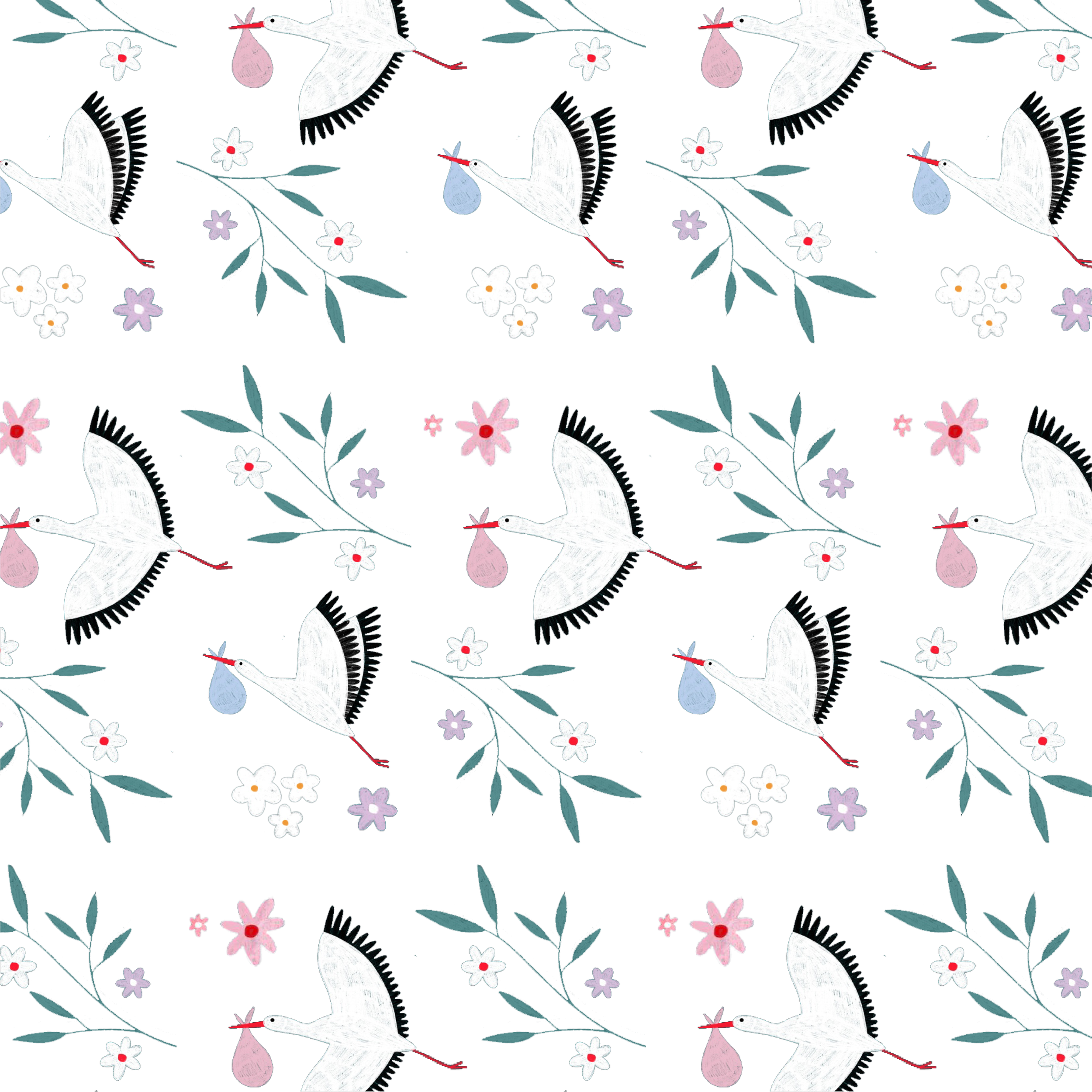
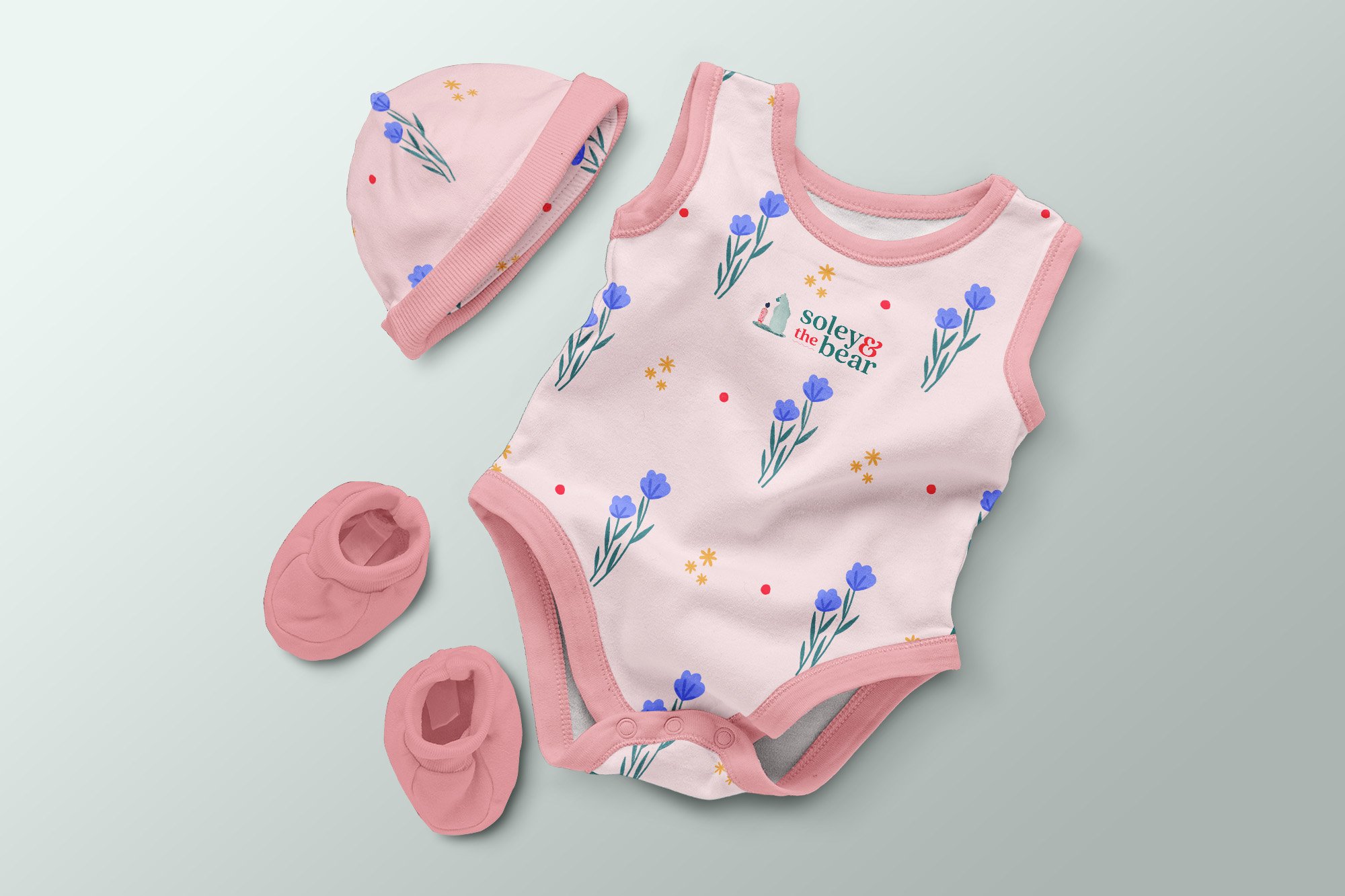
Soley & the Bear began with artist Bea Müller’s love for her daughter, Soley. I led the art direction and designed the brand identity and marketing assets for this inclusive, nature-led concept celebrating the bond between caregiver and child. The bear symbol represents protection, comfort and the strength of every parent or guardian.
The brand centres on self-care, connection and postnatal support, while also championing female empowerment—helping “mamma bears” grow with confidence as parents and individuals.
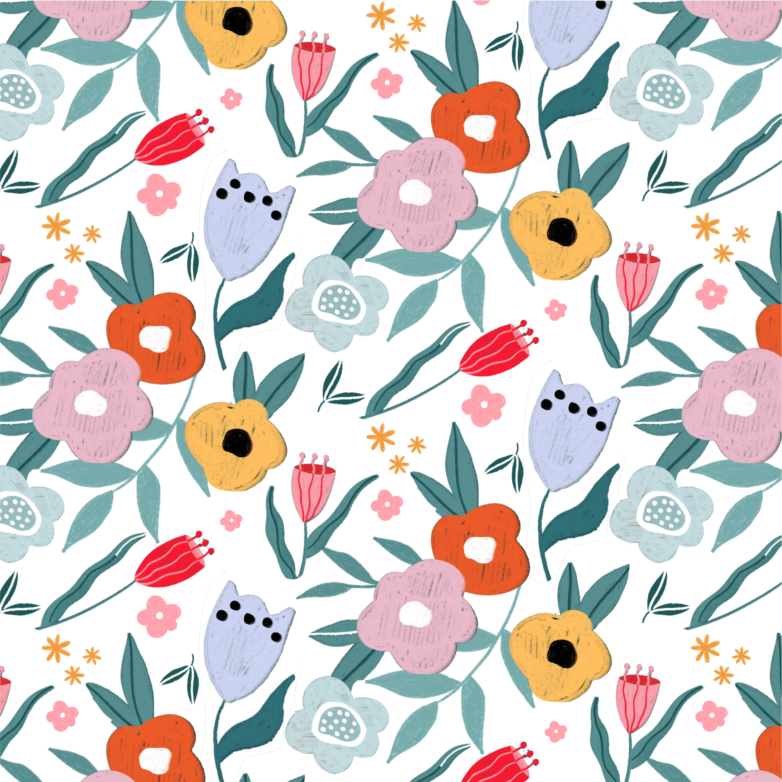
Through nature-inspired illustrations and a warm visual language, I shaped a cohesive identity that supports a more balanced, sustainable way of living. Soley & the Bear creates a welcoming space where women from all backgrounds can reconnect, recharge and thrive.